
Chart
Charts turn report data into a visual summary, such as the number of findings at each severity level. Place the cursor where you want the chart, click Chart in the toolbar, then select the chart to open its settings on the right.
Choose a chart type
Switch between Bar, Pie, Line, and Donut without re-entering your data.
- Bar compares values across categories, for example findings by severity. Under Bar Options, choose Vertical or Horizontal; horizontal bars leave more room for category names.
- Pie and Donut show how categories contribute to a total. Keep the number of slices small enough to distinguish them.
- Line connects points in the order they appear in Data Points. Use it for an ordered sequence, such as scores across assessment rounds.
Size and appearance
In Properties, set the title, width, and height in pixels. The width field shows the maximum allowed by the page margins. Horizontal bar charts grow vertically as you add points.
Use Show Title, Show Legend, and Show Values to control what accompanies the chart. In a horizontal bar chart, the legend labels sit beside the bars.
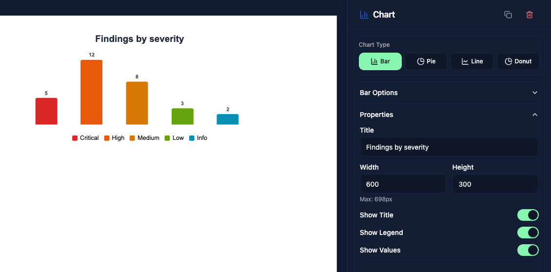
Open Appearance to change the title color, background, and border. A border width of 0 hides the border. Set each bar or slice's color separately in Data Points.
Data points
Open Data Points to edit each point's Label, Value, and Color. Use + to add a point and the trash icon on its row to remove it. A chart can contain between 1 and 20 points.
Enter a number for a fixed value, or a LiquidJS expression to use data from the report. Changing a label alone does not connect it to report data.
Findings by severity
For a chart that updates with each report, replace the five default values with these expressions:
| Label | Value |
|---|---|
| Critical | {{stats.criticalCount}} |
| High | {{stats.highCount}} |
| Medium | {{stats.mediumCount}} |
| Low | {{stats.lowCount}} |
| Info | {{stats.infoCount}} |
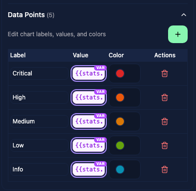
The purple VAR badge identifies variable values. The designer uses placeholder sizes and a variable marker on the chart; these are not the report's actual counts. Check the chart in the report preview to see the resolved values. Expressions should return numbers: empty or non-numeric results become 0 in the preview.
Progress bars
For values measured against a fixed scale, choose Bar, then Progress under Bar Options. Set Max Value to the top of the scale and Empty Color to the color of the unfilled portion. Both orientations are available.
For example, to compare three scores out of 10, set Max Value to 10 and enter 8, 6, and 3 as the point values. With Show Values enabled, the bars display 8/10, 6/10, and 3/10.
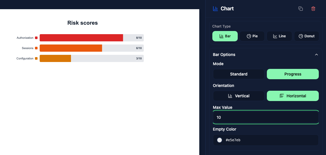
Standard bars scale to the largest value in the chart. Progress bars share the maximum you set, making the scale consistent across reports. Keep values within that scale; a value above the maximum fills the bar completely.